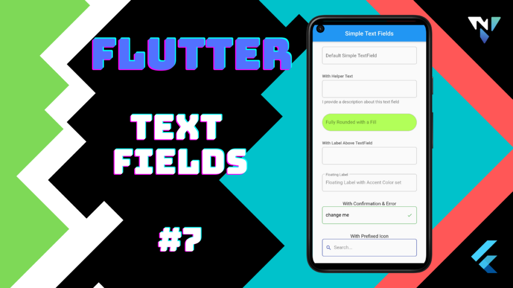
Tutorial and code of text fields in flutter. Copy and paste the below code as per your requirements.
import 'package:flutter/material.dart';

void main() => runApp(MyApp());

class MyApp extends StatelessWidget {
  @override
  Widget build(BuildContext context) {
    return MaterialApp(
      debugShowCheckedModeBanner: false,
      title: 'Welcome to Flutter',
      home: Scaffold(
        appBar: AppBar(
          title: Center(child:Text('Simple Text Fields'),) ,
        ),
        body: ListView(
          padding: const EdgeInsets.symmetric(horizontal: 32.0, vertical: 64),
          children: intersperse(
            const SizedBox(
              height: 32,
            ),
            [
              const SimpleTextField(
                labelText: 'Default Simple TextField',
              ),
              SimpleTextField(
                labelText: 'With Helper Text',
                helperText: "I provide a description about this text field",
                showLabelAboveTextField: true,
                textColor: Colors.black,
                accentColor: Colors.red[900],
              ),
              const SimpleTextField(
                hintText: 'Fully Rounded with a Fill',
                textColor: Colors.black,
                borderRadius: 1000,
                fillColor: Colors.lightGreenAccent,
              ),
              const SimpleTextField(
                labelText: 'With Label Above TextField',
                showLabelAboveTextField: true,
                textColor: Colors.black,
                accentColor: Colors.green,
              ),
              const SimpleTextField(
                hintText: 'Floating Label with Accent Color set',
                labelText: 'Floating Label',
                floatingLabelBehavior: FloatingLabelBehavior.always,
                textColor: Colors.black,
                accentColor: Colors.purple,
              ),
              Column(
                children: [
                  const Text(
                    "With Confirmation & Error",
                    style: TextStyle(fontSize: 16),
                  ),
                  SimpleTextField(
                    textEditingController:
                        TextEditingController(text: 'change me'),
                    validator: (val) => val == "change me",
                  ),
                ],
              ),
              Column(
                children: const [
                  Text(
                    "With Prefixed Icon",
                    style: TextStyle(fontSize: 16),
                  ),
                  SimpleTextField(
                    hintText: "Search...",
                    prefixIconData: Icons.search,
                    accentColor: Colors.indigo,
                  ),
                ],
              ),
            ],
          ).toList(),
        ),
      ),
    );
  }
}

class SimpleTextField extends StatefulWidget {
  const SimpleTextField(
      {this.onChanged,
      this.textEditingController,
      this.autofillHints,
      this.textInputType,
      this.autoFocus = false,
      this.obscureText = false,
      this.textInputAction,
      this.focusNode,
      this.prefixIconData,
      this.hintText,
      this.labelText,
      this.errorText,
      this.helperText,
      this.showLabelAboveTextField = false,
      this.floatingLabelBehavior = FloatingLabelBehavior.auto,
      this.fillColor,
      this.accentColor,
      this.textColor = Colors.black,
      this.borderRadius = 6,
      this.validator,
      this.showConfirmation = true,
      this.showError = true,
      this.verticalPadding = 20,
      this.horizontalPadding = 12,
      Key key})
      : super(key: key);

  final Function(String) onChanged;
  final TextEditingController textEditingController;
  final Iterable<String> autofillHints;
  final TextInputType textInputType;
  final bool autoFocus;
  final bool obscureText;
  final TextInputAction textInputAction;
  final FocusNode focusNode;
  final IconData prefixIconData;
  final String hintText;
  final String labelText;
  final String errorText;
  final String helperText;
  final bool showLabelAboveTextField;
  final FloatingLabelBehavior floatingLabelBehavior;
  final Color fillColor;
  final Color accentColor;
  final Color textColor;
  final double borderRadius;
  final bool Function(String) validator;
  final bool showConfirmation;
  final bool showError;
  final double verticalPadding;
  final double horizontalPadding;

  @override
  _SimpleTextFieldState createState() => _SimpleTextFieldState();
}

class _SimpleTextFieldState extends State<SimpleTextField> {
  FocusNode focusNode;
  TextEditingController textEditingController;
  bool hasConfirmation;
  bool hasError;
  bool hasFocus;

  @override
  void initState() {
    super.initState();
    hasFocus = false;
    textEditingController =
        widget.textEditingController ?? TextEditingController();
    hasConfirmation = isValid;
    hasError = !isValid;
    focusNode = widget.focusNode ?? FocusNode();

    focusNode.addListener(() {
      setState(() {
        hasFocus = focusNode.hasPrimaryFocus;
        bool valid = isValid;
        hasConfirmation = valid;
        hasError = !valid;
      });
    });
  }

  bool get isValid {
    if (hasValidator) {
      return widget.validator(textEditingController.text);
    }
    return false;
  }

  bool get hasValidator {
    return widget.validator != null;
  }

  @override
  Widget build(BuildContext context) {
    ThemeData currentTheme = Theme.of(context);

    OutlineInputBorder buildFocusedBorder() {
      if (hasValidator) {
        if (hasConfirmation && widget.showConfirmation) {
          return OutlineInputBorder(
              borderSide: const BorderSide(color: Colors.green, width: 1.25),
              borderRadius: BorderRadius.circular(widget.borderRadius));
        } else if (hasError) {
          return OutlineInputBorder(
            borderSide: const BorderSide(color: Colors.red, width: 1.25),
            borderRadius: BorderRadius.circular(widget.borderRadius),
          );
        }
      }
      return OutlineInputBorder(
        borderSide: BorderSide(
            color: widget.accentColor ?? currentTheme.primaryColor,
            width: 1.25),
        borderRadius: BorderRadius.circular(widget.borderRadius),
      );
    }

    OutlineInputBorder buildEnabledBorder() {
      if (hasValidator) {
        if (hasConfirmation) {
          return OutlineInputBorder(
            borderSide: const BorderSide(color: Colors.green),
            borderRadius: BorderRadius.circular(widget.borderRadius),
          );
        } else if (hasError) {
          return OutlineInputBorder(
            borderSide: const BorderSide(color: Colors.red),
            borderRadius: BorderRadius.circular(widget.borderRadius),
          );
        }
      }
      return OutlineInputBorder(
        borderRadius: BorderRadius.circular(widget.borderRadius),
        borderSide: BorderSide(
          color: Colors.grey[400],
        ),
      );
    }

    TextStyle buildLabelStyle() {
      if (hasFocus) {
        return TextStyle(color: widget.accentColor);
      } else {
        return null;
      }
    }

    Icon buildSuffixIcon() {
      if (hasValidator) {
        if (hasConfirmation) {
          return const Icon(Icons.check, color: Colors.green);
        } else if (hasError) {
          return const Icon(
            Icons.error,
            color: Colors.red,
            size: 24,
          );
        }
      }
      return null;
    }

    return TextSelectionTheme(
      data: TextSelectionThemeData(
        selectionColor: widget.accentColor?.withOpacity(.33) ??
            currentTheme.primaryColor.withOpacity(.33),
      ),
      child: Column(
        crossAxisAlignment: CrossAxisAlignment.start,
        children: [
          if (widget.labelText != null && widget.showLabelAboveTextField) ...[
            Text(
              widget.labelText,
              style: TextStyle(
                fontWeight: FontWeight.w500,
                color: hasFocus ? currentTheme.primaryColor : Colors.grey[700],
              ),
            ),
            const SizedBox(height: 6),
          ],
          TextField(
            focusNode: focusNode,
            controller: textEditingController,
            autofillHints: widget.autofillHints,
            keyboardType: widget.textInputType,
            autofocus: widget.autoFocus,
            onChanged: (val) {
              setState(() {
                hasError = false;
                hasConfirmation = isValid;
              });
              if (widget.onChanged != null) {
                widget.onChanged(val);
              }
            },
            style: TextStyle(color: widget.textColor),
            cursorColor: widget.textColor,
            obscureText: widget.obscureText,
            textInputAction: widget.textInputAction,
            decoration: InputDecoration(
              contentPadding: EdgeInsets.symmetric(
                  vertical: widget.verticalPadding,
                  horizontal: widget.horizontalPadding),
              isDense: true,
              hintText: widget.hintText,
              hintStyle: TextStyle(color: widget.textColor.withOpacity(.45)),
              labelText:
                  widget.showLabelAboveTextField ? null : widget.labelText,
              labelStyle: buildLabelStyle(),
              errorText: widget.errorText != null && hasError && hasValidator
                  ? widget.errorText
                  : null,
              floatingLabelBehavior: widget.floatingLabelBehavior,
              fillColor: widget.fillColor,
              filled: widget.fillColor != null,
              focusedBorder: buildFocusedBorder(),
              enabledBorder: buildEnabledBorder(),
              border: OutlineInputBorder(
                borderRadius: BorderRadius.circular(widget.borderRadius),
              ),
              prefixIcon: widget.prefixIconData != null
                  ? Padding(
                      padding: const EdgeInsets.only(left: 12.0, right: 8),
                      child: Icon(
                        widget.prefixIconData,
                        color: hasFocus
                            ? widget.accentColor
                            : widget.textColor.withOpacity(.6),
                        size: 20,
                      ),
                    )
                  : null,
              prefixIconConstraints:
                  const BoxConstraints(minHeight: 24, minWidth: 24),
              suffixIcon: buildSuffixIcon(),
            ),
          ),
          if (widget.helperText != null) ...[
            const SizedBox(height: 6),
            Text(
              widget.helperText,
              style: TextStyle(
                color: Colors.grey[600],
              ),
            )
          ]
        ],
      ),
    );
  }
}
Iterable<T> intersperse<T>(T element, Iterable<T> iterable) sync* {
  final iterator = iterable.iterator;
  if (iterator.moveNext()) {
    yield iterator.current;
    while (iterator.moveNext()) {
      yield element;
      yield iterator.current;
    }
  }
}