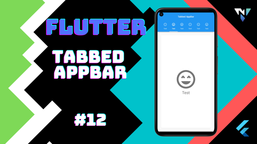
Tutorial and code of tabbed appbar in flutter. Copy and paste the below code as per your requirements.
import 'package:flutter/material.dart';

void main() {
  runApp(const MyApp());
}

class MyApp extends StatelessWidget {
  const MyApp({Key? key}) : super(key: key);

  // This widget is the root of your application.
  @override
  Widget build(BuildContext context) {
    return MaterialApp(
      debugShowCheckedModeBanner: false,
      home: DefaultTabController(
        length: choices.length,
        child: Scaffold(
          appBar: AppBar(
            title: const Center(child: Text("Tabbed AppBar"),),
            bottom: TabBar(
              isScrollable: true,
              tabs: choices.map<Widget>((Choice choice) {
                return Tab(
                  text: choice.title,
                  icon: Icon(choice.icon),
                );
              }).toList(),
            ),
          ),
          body: TabBarView(
            children: choices.map((Choice choice) {
              return Padding(
                padding: const EdgeInsets.all(20.0),
                child: ChoicePage(
                  choice: choice,
                ),
              );
            }).toList(),
          ),
        ),
      ),
    );
  }
}
class Choice {
  final String title;
  final IconData icon;
  const Choice({required this.title, required this.icon});
}

const List<Choice> choices = <Choice>[
  Choice(title: 'Test', icon: Icons.sentiment_satisfied),
  Choice(title: 'Test', icon: Icons.sentiment_very_satisfied_sharp),
  Choice(title: 'Test', icon: Icons.sentiment_very_dissatisfied_outlined),
  Choice(title: 'Test', icon: Icons.sentiment_dissatisfied),
  Choice(title: 'Test', icon: Icons.sentiment_satisfied_outlined),
  Choice(title: 'Test', icon: Icons.sentiment_very_satisfied),
];

class ChoicePage extends StatelessWidget {
  const ChoicePage({Key? key,required this.choice}) : super(key: key);
  final Choice choice;

  @override
  Widget build(BuildContext context) {
    final TextStyle? textStyle = Theme.of(context).textTheme.headline4;
    return Card(
      color: Colors.white,
      child: Center(
        child: Column(
          mainAxisSize: MainAxisSize.min,
          crossAxisAlignment: CrossAxisAlignment.center,
          children: <Widget>[
            Icon(
              choice.icon,
              size: 150.0,
              color: textStyle?.color,
            ),
            Text(
              choice.title,
              style: textStyle,
            ),
          ],
        ),
      ),
    );
  }
}
Leave a Reply