Tutorial and code of Rulers in Flutter. Copy and paste the below code as per your requirements.
rulers: ^1.0.7
import 'package:flutter/material.dart';
import 'package:rulers/rulers.dart';
void main() => runApp(const MyApp());
class MyApp extends StatelessWidget {
const MyApp({Key? key}) : super(key: key);
@override
Widget build(BuildContext context) {
return MaterialApp(
debugShowCheckedModeBanner: false,
title: 'Flutter Demo',
theme: ThemeData(
primarySwatch: Colors.blue,
textTheme: const TextTheme(
headline3: TextStyle(
color: Colors.black,
fontWeight: FontWeight.bold,
fontSize: 20))),
home: const Demo(),
);
}
}
class Demo extends StatefulWidget {
const Demo({Key? key}) : super(key: key);
@override
_DemoState createState() => _DemoState();
}
class _DemoState extends State<Demo> {
@override
Widget build(BuildContext context) {
return Scaffold(
appBar: AppBar(
title: const Center(child: Text('Rulers')),
),
body: Padding(
padding: const EdgeInsets.all(8.0),
child: SingleChildScrollView(
child: Padding(
padding: const EdgeInsets.only(top: 20.0),
child: Column(
mainAxisSize: MainAxisSize.min,
children: <Widget>[
Text(
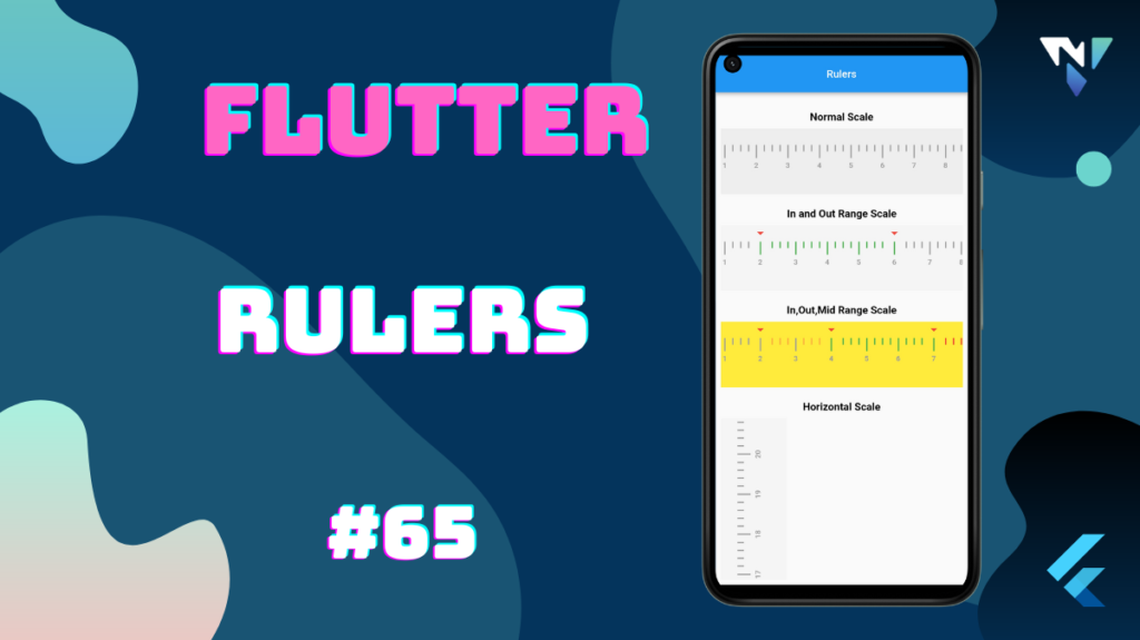
'Normal Scale',
style: Theme.of(context).textTheme.headline3,
),
Container(
margin: const EdgeInsets.only(top: 8.0),
child: RulerWidget(
height: 100,
scaleBackgroundColor: Colors.grey.shade200,
largeScaleBarsInterval: 24,
smallScaleBarsInterval: 3,
barsColor: Colors.grey,
indicatorWidget: Column(
children: const <Widget>[
Icon(
Icons.arrow_drop_down,
color: Colors.red,
),
],
),
),
),
Padding(
padding: const EdgeInsets.only(top: 20.0),
child: Text(
'In and Out Range Scale',
style: Theme.of(context).textTheme.headline3,
),
),
Container(
margin: const EdgeInsets.only(top: 8.0),
child: RulerWidget(
height: 100,
scaleBackgroundColor: Colors.grey.shade100,
indicatorWidget: Column(
children: const <Widget>[
Icon(
Icons.arrow_drop_down,
color: Colors.red,
),
],
),
largeScaleBarsInterval: 24,
smallScaleBarsInterval: 3,
lowerIndicatorLimit: 2,
lowerMidIndicatorLimit: 2,
upperMidIndicatorLimit: 6,
upperIndicatorLimit: 6,
barsColor: Colors.grey,
inRangeBarColor: Colors.green,
behindRangeBarColor: Colors.orangeAccent,
outRangeBarColor: Colors.red,
),
),
Padding(
padding: const EdgeInsets.only(top: 20.0),
child: Text(
'In,Out,Mid Range Scale',
style: Theme.of(context).textTheme.headline3,
),
),
Container(
margin: const EdgeInsets.only(top: 8.0),
child: RulerWidget(
height: 100,
scaleBackgroundColor: Colors.yellow,
indicatorWidget: Column(
children: const <Widget>[
Icon(
Icons.arrow_drop_down,
color: Colors.red,
),
],
),
largeScaleBarsInterval: 24,
smallScaleBarsInterval: 3,
lowerIndicatorLimit: 2,
lowerMidIndicatorLimit: 4,
upperMidIndicatorLimit: 7,
upperIndicatorLimit: 8,
barsColor: Colors.grey,
inRangeBarColor: Colors.green,
behindRangeBarColor: Colors.orangeAccent,
outRangeBarColor: Colors.red,
),
),
Padding(
padding: const EdgeInsets.only(top: 20.0),
child: Text(
'Horizontal Scale',
style: Theme.of(context).textTheme.headline3,
),
),
Container(
margin: const EdgeInsets.only(top: 8.0),
alignment: Alignment.centerLeft,
child: RulerWidget(
scaleBackgroundColor: Colors.grey.shade100,
height: 100,
indicatorWidget: Column(
children: const<Widget>[
Icon(
Icons.arrow_drop_down,
color: Colors.red,
),
],
),
largeScaleBarsInterval: 20,
smallScaleBarsInterval: 4,
lowerIndicatorLimit: 0,
lowerMidIndicatorLimit: 0,
upperMidIndicatorLimit: 0,
upperIndicatorLimit: 0,
barsColor: Colors.grey,
inRangeBarColor: Colors.green,
behindRangeBarColor: Colors.orangeAccent,
outRangeBarColor: Colors.red,
axis: Axis.vertical,
),
),
],
),
),
),
),
);
}
}
Leave a Reply