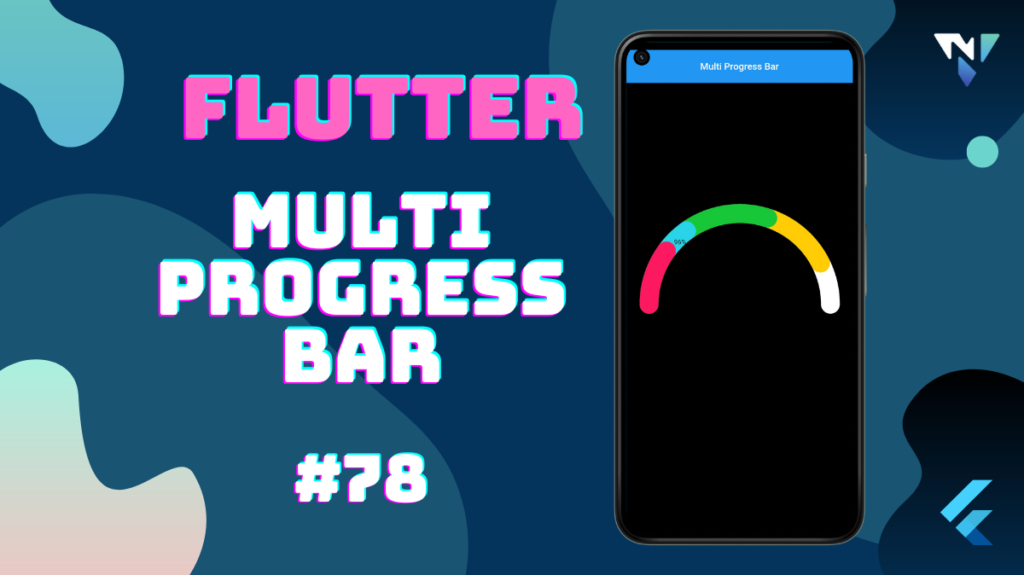
Tutorial and code of Multi Progress Bar in Flutter. Copy and paste the below code as per your requirements.
multi_circular_slider: ^0.0.3
import 'package:flutter/material.dart';

import 'package:multi_circular_slider/multi_circular_slider.dart';

void main() {
  runApp(const MyApp());
}

class MyApp extends StatelessWidget {
  const MyApp({Key? key}) : super(key: key);

  @override
  Widget build(BuildContext context) {
    return const MaterialApp(
      debugShowCheckedModeBanner: false,
      title: 'Multi Progress Bar',
      home: MyTestWidget(),
    );
  }
}

class MyTestWidget extends StatelessWidget {
  const MyTestWidget({Key? key}) : super(key: key);

  @override
  Widget build(BuildContext context) {
    return Scaffold(
      appBar: AppBar(
        title: const Center(child: Text("Multi Progress Bar"),),
      ),
      backgroundColor: Colors.black12,
      body: SafeArea(
        child: Center(
          child: MultiCircularSlider(
            size: MediaQuery.of(context).size.width * 0.8,
            values: const [0.2, 0.1, 0.3, 0.25],
            colors: const [ Color(0xFFFD1960),  Color(0xFF29D3E8),  Color(0xFF18C737),  Color(0xFFFFCC05)],
            showTotalPercentage: true,
            label: 'This is label text',
            animationDuration: const Duration(milliseconds: 500),
            animationCurve: Curves.easeIn,
            innerIcon: const Icon(Icons.integration_instructions),
            innerWidget: const Text('96%'),
            trackColor: Colors.white,
            progressBarWidth: 52.0,
            trackWidth: 52.0,
            labelTextStyle: const TextStyle(),
            percentageTextStyle: const TextStyle(),
          ),
        ),
      ),
    );
  }
}