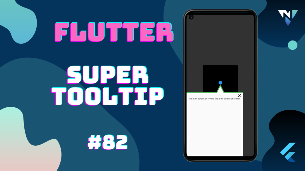
Tutorial and code of Super ToolTip in Flutter. Copy and paste the below code as per your requirements.
super_tooltip: ^1.0.1
import 'dart:async';

import 'package:flutter/material.dart';
import 'package:super_tooltip/super_tooltip.dart';

void main() => runApp(const MyApp());

class MyApp extends StatelessWidget {
  const MyApp({Key? key}) : super(key: key);

  @override
  Widget build(BuildContext context) {
    return MaterialApp(
      debugShowCheckedModeBanner: false,
      title: 'Flutter Demo',
      theme: ThemeData(
        primarySwatch: Colors.blue,
      ),
      home: const MyHomePage(),
    );
  }
}

class MyHomePage extends StatefulWidget {
  const MyHomePage({
    Key? key,
  }) : super(key: key);
  @override
  _MyHomePageState createState() => _MyHomePageState();
}

class _MyHomePageState extends State<MyHomePage> {
  @override
  Widget build(BuildContext context) {
    return const Scaffold(
      backgroundColor: Colors.black45,
      body: Center(child: TargetWidget()),
    );
  }
}

class TargetWidget extends StatefulWidget {
  const TargetWidget({Key? key}) : super(key: key);

  @override
  _TargetWidgetState createState() => _TargetWidgetState();
}

class _TargetWidgetState extends State<TargetWidget> {
  SuperTooltip? tooltip;

  Future<bool> _willPopCallback() async {
    if (tooltip!.isOpen) {
      tooltip!.close();
      return false;
    }
    return true;
  }

  void onTap() {
    if (tooltip != null && tooltip!.isOpen) {
      tooltip!.close();
      return;
    }

    var renderBox = context.findRenderObject() as RenderBox;
    final overlay = Overlay.of(context)!.context.findRenderObject() as RenderBox?;

    var targetGlobalCenter = renderBox
        .localToGlobal(renderBox.size.center(Offset.zero), ancestor: overlay);

    // We create the tooltip on the first use
    tooltip = SuperTooltip(
      popupDirection: TooltipDirection.left,
      arrowTipDistance: 15.0,
      arrowBaseWidth: 40.0,
      arrowLength: 40.0,
      borderColor: Colors.green,
      borderWidth: 5.0,
      snapsFarAwayVertically: true,
      showCloseButton: ShowCloseButton.inside,
      hasShadow: false,
      touchThrougArea: Rect.fromLTWH(targetGlobalCenter.dx - 100,
          targetGlobalCenter.dy - 100, 200.0, 160.0),
      touchThroughAreaShape: ClipAreaShape.rectangle,
      content: const Material(

          child: Padding(
            padding: EdgeInsets.only(top: 20.0),
            child: Text(
              "This is the content of ToolTip.This is the content of ToolTip. ",
              softWrap: true,
            ),
          )),
    );

    tooltip!.show(context);
  }

  @override
  Widget build(BuildContext context) {
    return WillPopScope(
      onWillPop: _willPopCallback,
      child: GestureDetector(
        onTap: onTap,
        child: Container(
            width: 20.0,
            height: 20.0,
            decoration: const BoxDecoration(
              shape: BoxShape.circle,
              color: Colors.blue,
            )),
      ),
    );
  }
}